Tuesday 1 January 2013

Exercise - Diagonals.

Exercise - Diagonals.

Following on from the previous exercises but now concentrating on diagonal lines within the frame.

Diagonal 1. 

This first photo shows diagonals in the roofs. Camera was handheld using natural light and auto settings. The exposure was reduced to counter the overexposure I was getting off the sky. In photoshop it was cropped and levels were set.

Diagonal 2.

This second photo was taken on one of my long walks down the beach. The diagonal of the water against breakwater seemed to work really well so took a few photos then settled on this one when I got home. Camera was handheld using natural light. All camera settings were auto. Photo was cropped and colours enhanced on photoshop.

Diagonal 3.

Bench in my back garden. I was going to use this in the previous exercise (horizontal) but could never get it looking good enough. Photographing it at this angle gave a much greater look to it. Camera was handheld using available light. All camera settings were set to auto. 

Diagonal 4.

This is a garden bench with frost on it. Camera was handheld using available light and all camera settings were set to auto.

Exercise. Horizontal and Vertical lines

Exercise. Horizontal and Vertical lines.

In this exercise we are to find examples of horizontal and vertical lines to photograph. I started with a couple of ideas but mainly just went out with the camera to see what I could find.

Horizontal 1.

I had just finished fixing the guttering when I noticed the strong shadow of the ladder against the wall. I grabbed my camera and set the Aperture to F8, all the other settings were on auto (Natural light). After walking around the ladder to see what angle I would get the best results from I decided on this. I converted it to black and white in Photoshop which really helped with the overall look.

Horizontal 2.

When mentioning a horizontal line I immediately thought of the horizon. This is one of the few photos in this exercise that was planned. Camera was set to highest Aperture of F8 and ISO was set to 100, all other settings were on auto. I took quite a lot of photos and when I got back picked this one to work with. In photoshop I altered the settings slightly so as to bring the sky out more.

Horizontal 3.

In this photo I have tried to make the walkway to the lifeboat station the main subject but also to keep it aesthetically pleasing to look at. Camera was handheld in natural light and was set to auto on all settings. On photoshop the photo was slightly cropped and converted to sepia, which I felt gave it an old postcard look.

Horizontal 4.

I was walking back from taking the lifeboat shot when I saw this. The horizontal lines of the boat were lost on the original photo but when I cropped in they became much clearer in the composition. Camera was handheld, full auto settings and using only natural light.

Vertical 1. 

This is in my back garden. I have cropped in such a way as the emphasize the verticalness of the object. Camera was handheld using available light. Automatic settings were used. In photoshop I enhanced the colour of the grass and path so as the make the sundial stand out more.

Vertical 2. 

The elements of the aerial really contrasted well against the blue sky which is why I took this photo. Camera was handheld and auto settings were used. Didn't do much to this in photoshop, just a slight crop and levels.

Vertical 3. 

After going on a very long walk I came across this, which I believe used to be part of an old railway that used to run from Selsey to Chichester. The upright posts are certainly what draws the eye to the photo but the original background really detracted from the photo so I cropped it all out. There is an almost stonehenge feel about this photo. Camera was handheld using available light. Aperture was set to F8 and ISO to 100 all other settings were on auto. In photoshop the colours were slightly enhanced and the levels were set.

Vertical 4. 

Completely unplanned, I was out walking then saw this in the distance. Camera was handheld using available light. All settings were set to auto and I zoomed in to fit subject in the frame. Slight adjustments were made in photoshop, slightly cropped and colours and levels set.

Friday 21 December 2012

Exercise - Multiple points

Exercise - Multiple points

Started by setting up background by laying a coloured sheet on a flat surface. Then I set up my tripod and fixed the camera. Camera was set to aperture F8 (the highest F no. on my camera) trying to keep all in focus, all other settings were auto. I then started to set up the first point to shoot.

Photo 1.
Shell was placed centrally trying to make it as aesthetically pleasing as possible.

Photo 2.
The two shells were placed like as if they were found in nature, still joined. The angle made the photo a lot more interesting than if the shells were linear.

Photo 3.
I had a play around with setting these shells up and found I liked this the most.

Photo 4.
Setting this up was quite a challenge, having 3 shells all the same made balancing the other shell difficult. In the end I made the single shell the central interest with the other 3 framing it.

Photo 5.
This seemed the logical position for the 5 shells.

Photo 6.
The final setup is quite pleasing, wish I had more time to do more with this.

Photo 7.
Final photo showing the relation between each point.

Thursday 13 December 2012

Exercise - The relationship between points

Exercise - The relationship between points

This exercise requires us to frame two points.

Photo 1 Boats

Although the smaller of the two boats is moving it is the larger boat that commands more attention. This is possibly because of the size and the clarity but also because the framing gives it much more dominance.

Photo 2 Light Switches

Thought this might look quite fun. Shot in the evening using available light with a 3 second exposure. The light switch on the right draws more attention than the other, probably because of the shadow giving more definition and it is on a larger, more darker slice of wall.

Photo 3 Gulls
I like the relationship between these two points as they seem to both draw my attention without either one being more prominent. I framed this in such a way as to have the birds balancing each other.

Wednesday 12 December 2012

Exercise - Positioning a point

Exercise - Positioning a point

This exercise is about experimenting with different positions you can place a single point in a frame.

Photo 1 Frosty leaf

Having a few frosty mornings at the moment and thought the leaf against the frosty grass contrasted really well. Experimented with a few different crops but this one seemed to work the best. 

Photo 2 Boat

 Living in a fishing town leads to not a lot of interesting things to photograph - hence the boat! Tried different ways of cropping this photo trying to find the most visually pleasing. Quite happy with the outcome.

Photo 3 Stone

Saw this stone on the beach and thought it contrasted well against the grainy sand. The smaller stone hopefully balances the the larger stone.

Monday 10 October 2011

Exercise - Cropping.

This exercise is all about taking 3 of my images and then cropping them so as to improve the overall look of the photo.


Photo 1. Harbour scene.

Original untouched version.
Proposed crop
Finished version.
I felt that the sky and the foreground dominated too much of this photo so cropped a lot of it off. The trees to the right were too dark and drew my eye away from the boats and so they were cropped as well. The finished piece encompasses all the features I wanted to capture within the photo.

Editing consisted of the straighten tool and levels in Photoshop elements.


Photo 2. Sailing boats.

Original untouched version.
Proposed crop.
Finished version.
The cropping I did on this photo seemed to be an obvious selection. The subject matter is what's important here and the masts really contrast well against the dark trees in the background so it was just a case of experimenting with crops around the boats until I found something that was pleasing to view. I am extremely happy with the final version.

Editing was straighten tool, levels and brightness/contrast on Photoshop elements.


Photo 3. Stairs

Original untouched version.
Proposed crop.
Finished version.

This last photo was fun. I remember when I took this photo how much I liked the curved banister contrasting against the rigid straight lines of the steps. When it came to cropping this piece I knew that the dark section on the left had to go as it didn't add to the piece in any form. I wasn't overly happy with the light coming through the balustrades at the top so cropped them off also. I decided to crop so the banister swooped from the top left corner to the bottom left corner which really worked for me. 

Editing on this photo consisted of levels and then a slight increase in contrast (Photoshop elements)..

Exercise - Vertical and horizontal frames.

In this exercise I am asked to compose 20 photos in vertical format and then take the same photos again but recomposed in the horizontal format. Everything shot has to fit within the frame. Equipment used - Fujifilm S100fs handheld. All photos are unedited unless otherwise stated.
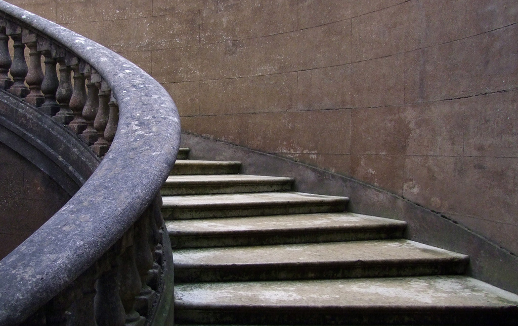

Image 1. Steps.


Image 1 seemed to fit the vertical aspect really well. Really liked the way that where the steps are leading is hidden which leaves the viewer wondering what is on the other side.


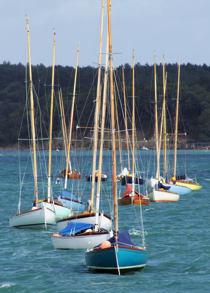
Image 2. Boat on the water.


In this shot I tried to follow the rule of thirds by having the horizon on one line and the boat on the other. Not sure if this shot works vertically as I prefer the horizontal aspect of it, probably because the boats length is horizontal.


Image 3. Breakwater.


I found this breakwater interesting because of the dark contrast it gave to the scene and the upright, weathered structure of it. I could've, and possibly should've, taken a close up of a single post to fill the frame but I found this to be a lot more aesthetically pleasing. The rule of thirds was again in the forefront of my mind when taking this.


Image 4. Boat on shingle.


I found it hard to photograph this boat because it was so dark. If I compensated too much then I overexposed the sky so I hope I've found a happy medium. This shot was inspired by the exercise photo on p.47 where the subject takes up the bottom of the shot. The horizontal version seems to follow the golden section.


 Image 5. Old winch and chair.


Really liked this rusty old winch and have been trying to get a decent photo of it for years. Armed with my new knowledge I walked around it with the hope that I could find something to balance it, hence the bench. The vertical view could benefit from cropping to remove the telegraph pole at the top and possibly some of the grass at the bottom.


Image 6. Decayed wooden post.


This is something I just happened across and was struck by the rusty loop around the rotten wooden post. After taking a few vertical shots I settled for this one as the angle of the wooden plank cutting through the photo seemed to work really well. The horizontal version I couldn't get to work quite as well so definitely prefer the vertical aspect of this scene.


Image 7. Plant on beach.


I'm always amazed at how some plants can grow in seemingly inhospitable places, that was what interested me in taking this picture. The blue sky  seemed to compliment the colours of the plant, which stood out dramatically against the stones. In the vertical version I used some small plants on the left to try and balance the main plant.


Image 8. Tree.


I took this photo because I liked the way the tree is right on the edge of where it can possibly grow. I had a swamp behind me so was restricted as to where I could stand to take the shot. I think the shot might've worked better at a different time of day as the light is far too harsh. As an experiment I put the subject at the top of the frame. I don't think this photo has worked at all well in either version.


Image 9. Butterfly resting.


A chance encounter and it stayed still long enough for me to get a few shots off. This butterfly was always going to contrast well against it's natural surroundings which gave me more time to think about composure. I really do think the vertical image lends itself to this kind of shot where the flower is as much a part of the composition as the butterfly. I tried to find something to balance the butterfly for the horizontal shot but it flew away.


Image 10. Twitchers.


Going to try and photograph people as much as possible to get used to it, that is why I took this shot. When composing the shot I was conscious of using the rule of thirds, which seemed to fit this particular picture. Not sure which view I prefer as they both appeal , although the vertical shot appears simpler and possibly draws your eye to the subject more.


Image 11. Pathway.


My thoughts about this picture was that a pathway should lend itself to a vertical frame nicely because of it's tendency to lead the eye from bottom to top. The vertical image would benefit from the sky (top left) being cropped out as I find it distracts from the photo. I don't think the horizontal version works as well as there is too much dead space on the left and right of the path.


Image 12. Tree on embankment.


Took a few photos of this vertically before settling on this one. I think the fencepost balances the tree out and there is a hint of the golden section about it. The tree contrasts well against the sky and sits well on the curved bank.


Image 13. Chapel.


This is an interesting building and had to walk round it a few times trying to find a good vertical shot. I decided in the end to have the chapel filling up the top of the shot and used a headstone at the bottom to balance it out. Normally I would never shoot a building vertically but I have found that it actually worked better than the horizontal shot on this occasion.


Image 14. Barrels by a gate.


The only reason I took this photo is because of the stark colour contrast between the barrels and the grass. Took a few pictures before I realized that the scene looked better from a lower perspective. The vertical shot has all the action in the lower part of the frame with a very uninteresting sky dominating the other half. The horizontal version uses the gate to add more depth to the scene.


Image 15. tree lined path.


Saw this and had to photograph it. The height of the trees really punctuates the left hand side and I love the way the path swoops round from the bottom corner and draws your eye into the distance. The horizontal shot was taken using the path as the main subject and using the trees as a curtain to hide what was to the left and to enhance the paths shape and depth.


Image 16. Old farm buildings (abstract)


All the different lines and textures is why I took this photo. This angle seemed to frame the vertical aspect well but I wish I had increased the aperture to get a bigger depth of field as I don't like the stone wall closest to the camera being out of focus. The vertical view works so much better than the horizontal with this shot.


Image 17. Toothbrushes.


The thinking behind this shot was that because of the layout it should fill a vertical frame quite well. Had to adjust the white balance to get rid of an awful blue/green cast. Tried a lot of angles but nothing really appealed, as such not overly impressed with these shots.


Image 18. Potted plant.


This plant and pot filled the vertical frame nicely and contrast quite well against the blue background. One criticism is that I should've trimmed back the dead tips on the leaves. I found the horizontal shot very difficult to look any good.


Image 19. Teddy.


This teddy is very special to me which is why I photographed it. The vertical framing works perfectly here because it's obvious as to what the subject is, whereas, in the horizontal framing the trellis in the background is a distraction. It's a shame because I liked the way the shadows framed the horizontal version.


Image 20. Signpost.


Took this shot based purely on the height of the signpost and thought it would lend itself to a vertical shot. Had to burn the signpost using Photoshop otherwise it looked too highlighted.  For the horizontal view I tried to incorporate the path but failed miserably!


Throughout this exercise I tried my hardest to incorporate what I have already learned. Some pictures follow the rule of thirds, some the golden section and others have balance within them. I found the exercise difficult as holding the camera to get vertical shots felt awkward, I am, however, happy with some of the results I achieved. I noticed that I went around looking for scenes/objects which would go well within a vertical frame and the horizontal aspect was not immediately obvious.